User:Daly
Contents
- 1 Overview
- 2 header
- 3 Tutorial
Overview
header
geWorkbench is an open-source bioinformatics platform that offers a comprehensive and extendible collection of tools for the management, analysis, visualization and annotation of biomedical data. This tool is aimed at providing researchers a centralized repository for the data analysis and visualization of gene expression data, gene sequences and protein sequences.
What can you do with geWorkbench?
- Use one program that integrates with multiple existing bioinformatics modules for analysis and visualization.
- Access remote servers and clusters for the performance of computationally intensive calculations - quicker!
- Streamline data analysis with:
- flexible import options that support merging files from various sources (insert possible data source ie RMA express).
- support for a variety of genomic data including microarrays, sequences, pathways, networks, alignments and phenotypes.
- access analyses with biological annotations from the National Cancer Institute.
- Community: Insert developer benefit ( plugin)
The diagram illustrates the use of geWorkbench by Researchers.

For detailed system documentation, please see the Documentation section (INSERT LINK).
Tutorial
Welcome!
Welcome to the geWorkbench tutorial. In the following tutorials you will learn how to use geWorkbench. This is an example based, illustrated guide for both beginners and experienced users. This tutorial was last updated in DATE and reflects changes to geWorkbench through DATE.
Using the Tutorial
These tutorials assume that you have successfully completed the installation instructions. If you haven't installed the entire program, please go Download and follow the installation instructions.
The tutorials are organized into a number of separate topics. Sample data sets that are used throughout the tutorials. Each tutorial is self contained and does not depend on any other tutorial for sample data. Sample data is located (INSERT LINK or Instructions on how to download)
(we should have sample data labeled Tutorial #)
Within the tutorials there are two basis types of text:
- Text that looks like this explains topics.
- Text in numbered steps is instructions for you to follow using tutorial data files.
insert instruction on how to navigate between tutorials.
==Getting Started== MV
- Starting the application
- GUI elements
- Panels
- Navigation
== Loading Data== MV
- Data formats
Working with Marker and Phenotype Panels
In this tutorial, you will:
- Become familiar with the use of panels in geWorkbench
- Create active phenotype panels
- Classify the panels you created
Before you can continue, geworkbench should be running. For help with this, please refer to the Getting Started (insertlink) section. Load the tutorial file cardiomyopathy.exp . Please refer to Load Data (insertlink)tutorial if you need assistance loading this file.
Creating Panels
When working with microarrays, geWorkBench uses the term marker to refer to a gene probe (in other cases, it can be individual items from other data sets, such as sequences). Phenotype refers to any user-defined grouping of microarrays. These microarrays will often share some common property that in most cases is phenotypic, although this is not a requirement. For example, one such “phenotype” might be a single experiment on a tumor tissue sample, with a second “phenotype” defined as a collection of experiments performed on normal tissue samples.
Assign Panel
1. In the Phenotype panel, select and the following arrays in the contain samples from the congestive cardiomyopathy disease state. JB-ccmp_0120.txt, JB-ccmp_0218.txt, JB-ccmp0718.txt, JB-ccmp0811.txt, JB-ccmp1003.txt, JB-ccmp_1109.tx
2. Right-click, select Add to Panel.
3. Enter "Cardio" in the input box and click OK.

4. Next, similarly label the follow arrays as "Normal" ( repeat steps 2 & 3 ). JB-n_0106.txt , JB-n_0821.txt, JB-n_0915.txt, JB-n_1303.txt
5. Select the checked boxes next to the panel name to indicate that these groups of arrays are "Active". Various analysis and visualization components can be set to only use/display activated arrays or markers.

Classify panel
For statistical tests such as the t-test, Case and Control groups can be specified.
- Left-click on the thumb-tack icon in front of the phenotype name.
- Select Case to specify the disease arrays as the "Case". The remaining "Normal" arrays are by default labeled control.

A red thumbtack indicates the arrays have been specified as "Case".

Visualize Gene Expression
In the this tutorial, you will:
- Get acquainted with the various geWorkbench visualization tools
- View a dataset in geWorkbench
- Modify the visualization preference settings
Before you can continue, geworkbench should be running. For help with this, please refer to the Getting Started (insertlink)section. The file cardiomyopathy.exp is used in the this tutorial is from the Load Data (insertlink)tutorial.
Visualization Tools
Visualization tools provide a view of the chip(s) under investigation and can be used for ascertaining the quality of the data. Active gene and phenotype panels (insertlink) restrict the number of markers/arrays displayed. The images created can be saved and exported. A detailed description on how to manipulate visualization componenets is described in online help.
| Microarray View: Used to inspect each separate microarray using the Array scroll bar. | 
|
| Tabular Microarray Panel: Presents the numerical values of the expression measurements in a table format. One row is created per individual marker/probe and one column per microarray. | 
|
| Color Mosaic: Heat maps for microarray expression data, organized by phenotypic or gene groupings. | 
|
| Expression Profiles: This is a line graph of genes expression profiles across several arrays/ hybridizations.Each marker is a separate color line. | 
|
| Scatter Plot: A pairwise (array vs. array and marker vs. marker) comparison and plotting of expression values. | 
|
View a dataset
- Select a cardiomyopathy.exp in the Project Panel.
- Select the Microarray Panel visualization component in the View Area at the top-right section of the interface.
- Deselect the All Markers checkbox to display the entire dataset.
Note: '''All Arrays''' and '''All Markers''' checkboxes determine which data points are included in the display.
If neither is checked, then the entire data set is shown. The All Arrays control is useful when working with data sets comprising multiple arrays. In this case, only those arrays that are included in a currently activated phenotype panel will be displayed.
![]()
Preferences
The Preferences selection in the Tools menu allows users to specify how certain aspects of the system will behave. Once your preferences are set, these preferences are persistent between application sessions and are applied at once.
Modifying Settings
1. From the main menu, click on Tools>Preferences.
2. In the Preferences pop-up window, you can define settings for:
- Text Editor: The editor selected will be used to open and inspect data sets loaded in a project. Notepad is the default setting.
- Visualization: The color scheme to be applied to color mosaic images.
- Absolute: (default) Let M = max{|min|, |max|} over all expression measurements, across all arrays. If expression value x > 0, assign it the red spectrum x / M * 256. If expression value x is negative, assign it to the green spectrum -x / M * 256.
- Relative: This is similar to the setting for Absolute, but each marker is mean-variance normalized first.
- Genepix Value Computation: You can specify how compute the value displayed for Genepix array. The default setting is Option (Mean F635 - Mean B635) / (Mean F532 - Mean B532).
Select Relative for the visualization preference.
3. Click on OK.

Filter and Normalize Data
In this tutorial, you will:
- Get acquainted with the various filters and normalizers available in geWorkbench
- Apply a filter and normalizer on a tutorial dataset
Before you can continue, geworkbench should be running. For help with installation, please refer to the Getting Started (INSERT LINK)section. Load the tutorial file cardiomyopathy.exp . Please refer to Load Data (insertlink)tutorial if you need assistance loading this file.
Filter
Filtering can be used to screen out missing data points, remove low quality data or reduce the size of the dataset by removing less interesting data. Available geWorkbench filters are as follows:
| Filter | Description | |
|---|---|---|
| Affy Detection Call | Applicable to Affymetrix data only. Sets all measurements whose detection status is any user-defined combination of A, P or M as missing. | |
| Missing values | Discards all markers that have “missing” measurements in at least n microarrays, where n is defined by the user. Another filter must first be applied however, in order to generate the missing values upon which this filter can operate. | |
| Deviation | Sets all markers whose measurements deviate below a given value across all microarrays as missing. | |
| Expression Threshold | Sets all markers whose measurements are inside (or outside) a user-defined range as missing. | |
| 2 Channel | Applicable to 2-channel arrays (Genepix) data only. Defines applicable ranges for each channel, and sets all values for which either channel intensity is inside (or outside) the defined range as missing. |

Perform the following steps to filter out data called absent in an Affymetrix file:
- In the Filtering Panel, select Affy Detection Call Filter.
- Select ‘A’ (Absent) checkbox and Filter. Values that were removed (marked as missing) are highlighted in yellow.
- In the Filtering Panel, select Missing Values Filter.
- Choose the maximum number of arrays that can have missing values before marker is removed – default is 0.
- Click Filter. Markers with more than 0 missing values are removed. You’ll notice the yellow values are gone
| Affy Detection Call Filter | Missing Values Filter | |
|---|---|---|
 |

|
Normalize
Normalization can be used to decrease the effects of systematic differences across a set of experiments. In geWorkbench, normalization results in replacing values with new values. Available geWorkbench normalization methods are as follows:
| Normalizer | Description | |
|---|---|---|
| Missing value calculation | Replaces every missing value with either the mean value of that marker across all microarrays or with the mean measurement of all markers in the microarray where the missing value is observed | |
| Log2 Transformation | Applies a log2 transformation to all measurements in a microarray | |
| Threshold Normalizer | All data points whose value is less than (or greater than) a user-specified minimum (maximum) value are raised (reduced) to that minimum (maximum) value | |
| Marker-based Centering | Subtracts the mean (median) measurement of a marker profile from every measurement in the profile | |
| Array-based centering | Subtracts the mean (median) measurement of a microarray from every measurement in that microarray | |
| Mean-variance normalizer | For every marker profile, the mean measurement of the entire profile is subtracted from each measurement in the profile and the resulting value is divided by the standard deviation |

Apply Quantile Normalizer
1. In the Normalization Panel, select Quantile Normalizer.
2. Leave the default averaging method of Mean Profile Marker to indicate handling of missing values..
3. Click Normalize. The View Area is updated to reflect normalization (after the screen has been refreshed). Note: The first value in the second row was update from 41,394.6 to 55,779.26.
| PRENORMALIZATION | NORMALIZED | |
|---|---|---|
 |
 . .
|
== Clustering Gene Expression Data== ken
- Hierarchical Clustering
- Self Organizing Map (SOM)
Differential Expression
In this tutorial, you will:
- Get acquainted with the T Test and Multi T Test
- Apply a T Test and Multi T Test
Before you can continue, geworkbench should be running. For help with installation, please refer to the Getting Started (INSERT LINK)section. Load the tutorial file cardiomyopathy.exp . Please refer to Load Data (insertlink)tutorial if you need assistance loading this file.
T Test
T Test analysis identifies markers with statistically significant differential expression between sets of microarrays. The t-test determines for each marker if there is a significant difference between the two groups (case and control). To perform this analysis, you must classify the panels, set the analysis parameters and view the results in the visualization components. A detailed description of the T Test parameters is described in online help.
Classify the Panels
1. Mark the Cardio phenotype a 'Case'. By default, panels are marked as control. Panels classified Case is shown with a red thumbtack icon.
- Right-click on Cardio phenotype.
- Select Classification>Case.
2. Activate the arrays Normal and Cardio by selecting the checkboxes next to the panel name.
Set Analysis Parameters
- From the Analysis Panel, select T-Test Analysis.
- Populate the below parameters values and click on Analyze.
- Alpha-corrections tab: Just Alpha.
- P-Value Parameters tab: p-values based on t-distribution. Note that the default alpha (critical p-value) is set to 0.01.
- Degree of Freedom tab: Welch approximation - unequal group variances.

T-Test Results
| Markers which met the significance test are included in a new gene panel called “Significant Genes”. | 
| |
| Ancillary dataset is created in the project window. | 
|
The values of the T-Test can be seen in the Color Mosaic panel and the Volcano Plot.
| VOLCANO PLOT | COLOR MOSAIC | |
|---|---|---|
 |
| |
| Clicking on any of the spots highlights the marker selected in the Marker Panel. * Insert another description |
|
=== Multi T Test=== (IN PROGRESS)
Regulatory Network
In this tutorial, you will:
- Create a gene network in Reverse Engineering
- View the network in Cytoscape
- Create a Marker panel from the Cytoscape network
Before you can continue, geworkbench should be running. The file Webmatrix.EXP used in the this tutorial. Please refer to Load Data (insertlink)tutorial if you need assistance loading this file
Reverse Engineering
The Reverse Engineering component is used to analyze a large amount of microarray data to reverse engineer the underlying gene regulatory network. The details of this algorithm is described in "ARACNE: An algorithm for the reconstruction of gene regulatory networks in a mammalian cellular context", Califano et. al. (http://arxiv.org/abs/q-bio.MN/0410037).
Create a Network
| 1. In the Gene Panel, enter 1973_s_at in the Find Next text box. The list box will navigate 1973_s_at, click on that gene. | 
|
| 2. Go to the Reverse Engineering in the View pane. You should be in the first tab “Profiler” and in “Basic”. The marker 1973_s_at should be listed in the Hub Gene box. | 
|
| 3. Click on Analyze 2D. A list of markers is returned sorted by interaction strength below Search Box. | |
| 4. Select all the genes with score >= 5 by clicking on the first marker [12.53] 37724_at, using Shift-down arrow to highlight the values >= 5. | 
|
| 5. Click Create Network The network created is displayed the Cytoscape view. |
View the Network in Cytoscape
A full description of the capabilities and functionality of Cytoscape can be found at http://www.cytoscape.org/.
- In the Cytoscape Layout menu, select yFiles/ Organic to modify the network display.
- In this network image, select the central marker. It should turn yellow.
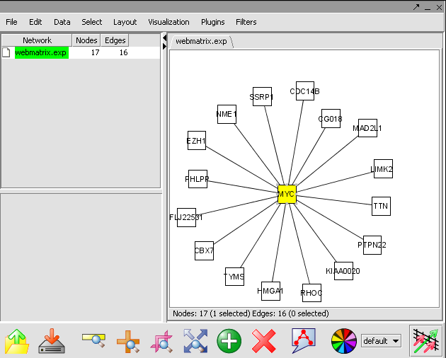
- In the Select menu, select Nodes>First neighbors of selected nodes>Shape>Triangle. The first neighbors is updated from a square shape to triangle.
- Ctrl+ mouse select the network. The nodes selected nodes are yellow. These selected genes are a returned to the Gene Panel with name Selected Genes[Cytoscape].

Enrichment Analysis
In this tutorial, you will:
- Map markers to Gene Ontology category definitions
Before you can continue, geworkbench should be running. For help with this, please refer to the Getting Started (insertlink) section. The file (INSERT FILE NAME) used in this tutorial.
Gene Ontology
Gene Ontology component provides categorization of genes in terms of function their products perform, their cellular localization or involvement in high level biological processes. The actual category definitions are provided by the Gene Ontology Consortium (http://www.geneontology.org ) which we make use of in generating a tree structure which approximates the Directed Acyclic Graph structure used by the Consortium. A detailed description of the Gene Ontology parameters is described in online help.
1. Create a Marker panel with the follow markers:
- AFFX-hum_alu_at
- AFFX-LysX-M_at
- AFFX-LysX-5_at
- AFFX-LysX-3_at
For assistance in creating a marker panel, please refer to Working with Markers and Phenotype Tutorial (INSERT LINK).
2. Click Map List. As the application creates a tree for the selected ontology, a pop-up window will display the progress. The mapping is based on GO mapping Annotation provided by Affymetrix in their annotation files.
3. The resulting nodes in the mapped tree will display two numbers separated by a forward slash such as cell (1/6058).
- The first number is the number of Genes mapped to a specific category and all its child nodes from the active marker panel.
- The second numbers after the slash are the mappings as above for the reference list (or the entire chip based on the reference list check-box selection and if a reference list is loaded from the file system).

The Table View and P Value Trends provide an alternate view of the mappings obtained in the Tree View.
| TABLE VIEW | P VALUE TREND | |
|---|---|---|
 |

| |
| Recompute: This re-computes the statistics based on the current widget settings ( pvalue metric, Min#) |
Plot: The ‘Plot’ will draw the plot based on selections in the Tree View and widget settings in the Step Size.
|
== Sequence Analysis== ken
- Sequence Retrieval
- Sequence Homology Analysis
- Blast
- Other
==Pattern Discovery== ken
- Position Histogram
Promoter Analysis
Integrated Annotation Information
In this tutorial, you will:
- rrrrr
- rrrrr
Before you can continue, geworkbench should be running. For help with this, please refer to the Getting Started (insertlink) section. The file (INSERT FILE NAME) used in the this tutorial.
Perform the following steps to view annotations of a dataset(Not recommended for large sets of genes):
1. In the Marker Annotations in the View pane, click Use Panels.
A table of gene names and links to pathway diagrams is returned if available from the NCI CGAP database.
2. Clicking on gene names returns annotations from the NCI CGAP database in your default web browser window.
3. Clicking on the pathway diagram name will display a pathway diagram in the caBIO Pathways panel in the View pane.
View pathway display in caBIO pathways viewer - pathway genes symbols can in turn be clicked to display their gene information in the default web browser window.