Difference between revisions of "User:Daly"
(→Visualize Gene Expression) |
|||
| Line 88: | Line 88: | ||
| + | '''(insert image)''' | ||
| + | |||
| + | '''Color Mosaic''' Heat maps for microarray expression data, organized by phenotypic or gene groupings. | ||
| + | |||
| + | '''(insert image)''' | ||
| + | |||
| + | |||
| + | |||
| + | '''Expression Profiles''' This is a line graph of genes expression profiles across several arrays/ hybridizations. | ||
| + | '''(insert image)''' | ||
| + | |||
| + | |||
| + | |||
| + | '''Expression Value Distribution (EVD) ''' A distribution plot of marker expression values across one or more microarrays. | ||
| + | |||
| + | '''(insert image)''' | ||
| + | |||
| + | |||
| + | |||
| + | '''Scatter Plot''' A pairwise (array vs. array and marker vs. marker) comparison and plotting of expression values. | ||
'''(insert image)''' | '''(insert image)''' | ||
Revision as of 16:03, 14 February 2006
Contents
- 1 Overview
- 2 Tutorials
- 2.1 Getting Started
- 2.2 Loading Data
- 2.3 Working with Marker and Phenotype Panels
- 2.4 Visualize Gene Expression
- 2.5 Filter and Normalize Data
- 2.6 Clustering Gene Expression Data
- 2.7 Differential Expression
- 2.8 Regulatory Network
- 2.9 Integrated Annotation Information
- 2.10 Enrichment Analysis
- 2.11 Sequence Analysis
- 2.12 Pattern Discovery
- 2.13 Promoter Analysis
Overview
'(who uses this , why/ what for? background )
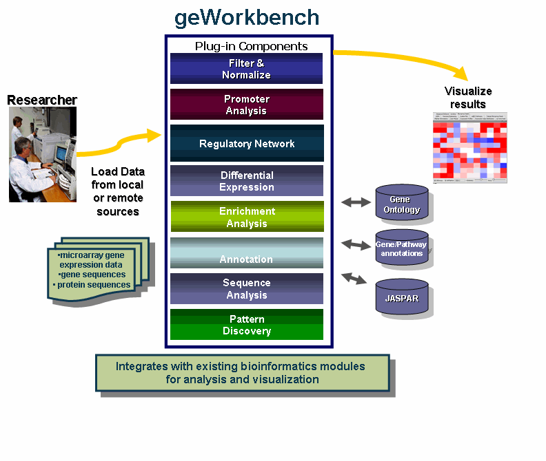
geWorkbench is an open-source bioinformatics platform that offers a comprehensive and extendible collection of tools for the management, analysis, visualization and annotation of biomedical data.
Benefits include:
- Integration with existing bioinformatics modules for analysis and visualization.
- Support for a variety of genomic data including microarrays, sequences, pathways, networks, alignments and phenotypes.
- Access to remote servers and clusters for the performance of computationally intensive calculations.
- Accesses analyses with biological annotations from the National Cancer Institute.
- Flexible import options: Allows user to merge files from various sources.
- Community: decribe this aspect
- Insert developer benefit ( plugin)
Tutorials
The following { insert description)
Getting Started
- Starting the application
- GUI elements
- Panels
- Navigation
Loading Data
- Data formats
Working with Marker and Phenotype Panels
Creating panels
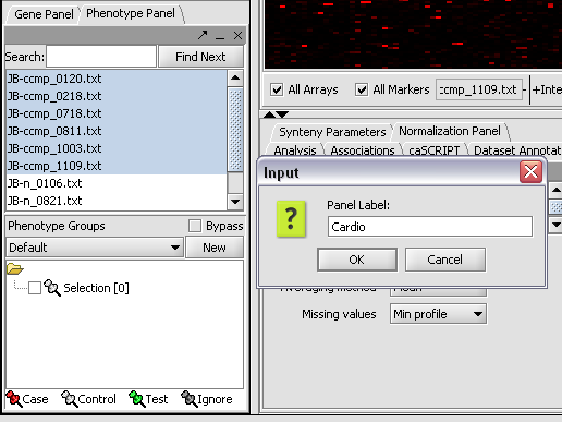
We can now assign phenotypes to each chip. We will place the phenotypes in the default group, however you can create new phenotype groups by pushing the New button on the Phenotype Panel at lower left.
Here we select and label arrays in the Phenotype Panel which contain samples from the congestive cardiomyopathy disease state...
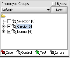
Next, we can similarly label the remaining arrays as "Normal". We have also checked boxes to indicate that these groups of arrays are "Active". Various analysis and visualization components can be set to only use/display activated arrays or markers.
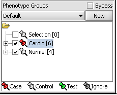
For statistical tests such as the t-test the Case and Control groups can be specified. This is done by left-clicking on the thumb-tack icon in front of the phenotype name. Here we are specifying the disease arrays as the "Case". The remaining "Normal" arrays are by default labeled control.
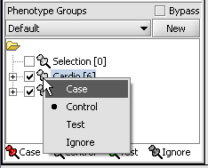
A red thumbtack indicates the arrays have been specified as "Case".
Visualize Panels
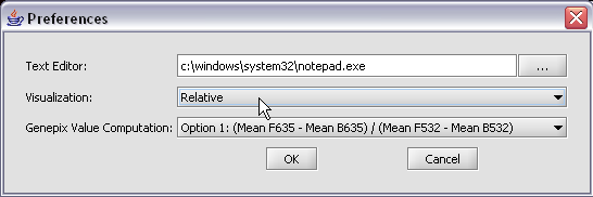
Here we select the relative display type.
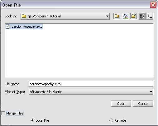
Returning to the Open File dialog as we before by right-clicking on the project entry, we will select the "cardiomyopathy.exp" file we previously saved...
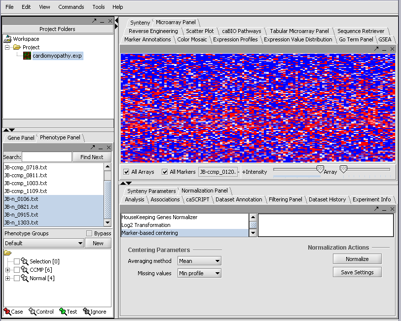
Resulting in the following colorful display of the array data for the first array....
Visualize Gene Expression
Visualization tools provide a view of the chip(s) under investigation and can be used for ascertaining the quality of the data. The phenotype and gene panel can be used to limit display. The images can be saved and exported.
The Microarray View can be used to inspect each separate microarray using the scroll bar.
(insert image)
The Tabular Microarray Panel can be used to see data in spreadsheet format. One row is created per individual marker/probe and one column per microarray.
(insert image)
Color Mosaic Heat maps for microarray expression data, organized by phenotypic or gene groupings.
(insert image)
Expression Profiles This is a line graph of genes expression profiles across several arrays/ hybridizations. (insert image)
Expression Value Distribution (EVD) A distribution plot of marker expression values across one or more microarrays.
(insert image)
Scatter Plot A pairwise (array vs. array and marker vs. marker) comparison and plotting of expression values. (insert image)
Filter and Normalize Data
Clustering Gene Expression Data
- Hierarchical Clustering
- Self Organizing Map (SOM)
Differential Expression
- T Test
- Multi Test
- Volcano Plot
- Color Mosaic
Regulatory Network
- Reverse Engineering
- Cytoscape
Integrated Annotation Information
Enrichment Analysis
- Go Term
- Go Miner
Sequence Analysis
- Sequence Retrieval
- Sequence Homology Analysis
- Blast
- Other
Pattern Discovery
- Position Histogram
