Difference between revisions of "Microarray Dataset Viewers"
(→Scatter Plot) |
|||
| Line 93: | Line 93: | ||
===Scatter Plot=== | ===Scatter Plot=== | ||
| − | A pairwise (''array vs. array and marker vs. marker'') comparison and plotting of expression values. The first marker selected serves as the x-axis reference, shown with a dark background; this can also be set by right-clicking and selecting the x-axis | + | A pairwise (''array vs. array and marker vs. marker'') comparison and plotting of expression values. The first array or marker selected serves as the x-axis reference, shown with a dark background; this can also be set by right-clicking and selecting the x-axis as shown). Subsequent choices are plotted against this reference. Up to six graphs can be displayed. Right-click options are shown in the second picture. |
| + | For two arrays, plot markers. A single marker set "All" is activated. | ||
| − | |||
| + | [[Image:Scatter_Plot_Arrays.png]] | ||
| + | |||
| + | |||
| + | For two markers, plot activated arrays. Each activated array set is shown in a different color. | ||
| + | |||
| + | |||
| + | [[Image:Scatter_Plot_Markers.png]] | ||
==Preparation== | ==Preparation== | ||
Revision as of 12:51, 23 April 2014
|
Home | Quick Start | Basics | Menu Bar | Preferences | Component Configuration Manager | Workspace | Information Panel | Local Data Files | File Formats | caArray | Array Sets | Marker Sets | Microarray Dataset Viewers | Filtering | Normalization | Tutorial Data | geWorkbench-web Tutorials |
Analysis Framework | ANOVA | ARACNe | BLAST | Cellular Networks KnowledgeBase | CeRNA/Hermes Query | Classification (KNN, WV) | Color Mosaic | Consensus Clustering | Cytoscape | Cupid | DeMAND | Expression Value Distribution | Fold-Change | Gene Ontology Term Analysis | Gene Ontology Viewer | GenomeSpace | genSpace | Grid Services | GSEA | Hierarchical Clustering | IDEA | Jmol | K-Means Clustering | LINCS Query | Marker Annotations | MarkUs | Master Regulator Analysis | (MRA-FET Method) | (MRA-MARINa Method) | MatrixREDUCE | MINDy | Pattern Discovery | PCA | Promoter Analysis | Pudge | SAM | Sequence Retriever | SkyBase | SkyLine | SOM | SVM | T-Test | Viper Analysis | Volcano Plot |
Contents
Outline
In this section, various tools for visualizing microarray expression data will be introduced. These components will be available whenever a microarray dataset is selected in the Workspace. Available options for each component will be depicted.
The visualizers displayed here are:
- Microarray Viewer
- Tabular Microarray Viewer
- CEL file image viewer
- Color Mosaic
- Expression Profiles
- Scatter Plot
The options for several of the components are set from the application toolbar Preferences menu, which will also be explained.
Overview
Visualization tools provide a view of the microarray datasets under investigation and can be used e.g. for ascertaining the quality of the data. Activating marker and array/phenotype sets can be used to restrict the number of markers/arrays displayed. The images created can be saved and exported. A more detailed description of how to manipulate visualization components is given in the online help.
Microarray Viewer
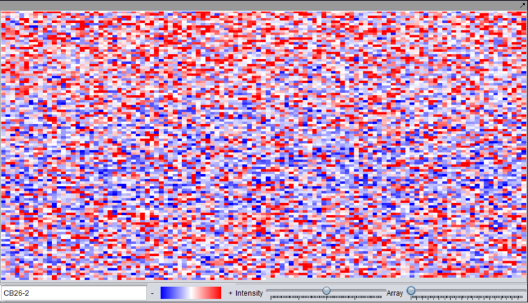
Used to inspect data from each separate microarray using the Array scroll bar. Note that the markers (probes or probesets) are displayed in the order they appear in the dataset, and the image is not a physical representation of the microarray layout. The image can be saved into the Workspace under its parent dataset by right-clicking and selecting Save Image.
The viewing preference shown here is the "relative" display mode. See Preferences for switching between relative and absolute display modes.
- Color gradient - shows the range of colors for the currently selected color display preference.
- Intensity - allows the intensity of the display to be adjusted.
- Array - Slider with which to select the array to view. The name of the current array is displayed in the text field to the left.
Tabular Microarray Viewer
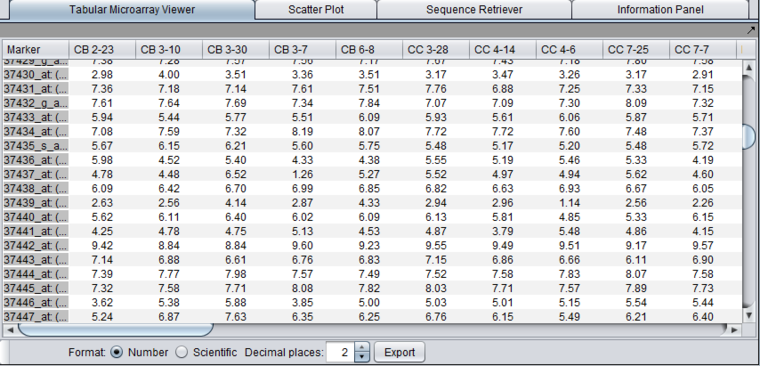
Presents the numerical values of the expression measurements in a table format. One row is created per individual marker/probe and one column per microarray.
- Format
- Number - display numbers in regular notation.
- Scientific - display numbers in scientific notation.
- Decimal Places - choose how many places after the decimal to display. Numbers are rounded to the specified precision.
- Export - Exports the displayed data to a tab-delimited spreadsheet format file. Note that the tabular viewer respects activated marker and array sets. If marker or array sets in the Markers/Arrays component have been activated, only those markers and/or arrays in the activated sets will be written to the file. This provides an easy way to export a subset of the data.
- Note - in the exported file, the format choices above are not preserved, and all significant digits are always written.
The Tabular Microarray Viewer using regular number format:
The Tabular Microarray Viewer using scientific format:
CEL file image viewer
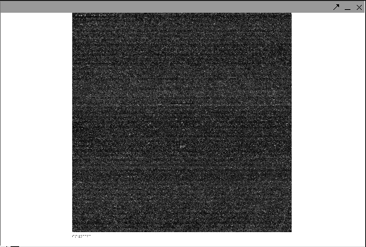
The Affymetrix CEL file contains a single intensity value calculated for each probe on the chip. It is derived from the raw image (.dat) file. Individual Affymetrix CEL files can be read into geWorkbench. They are displayed in the CEL file image viewer. This can be used to check for obvious problems such as fingerprints or uneven drying which could affect data quality. Note that is file is not an exact image of the chip, but a reconstructed image at the probe level. The CEL file image viewer component is simply a viewer, it does not permit any operations on the image.
Color Mosaic
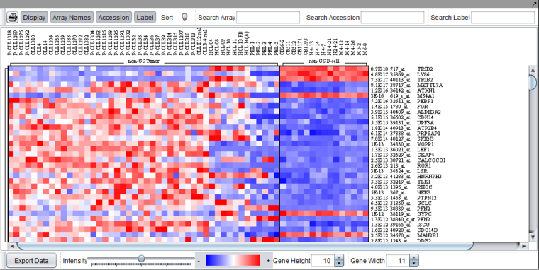
Please see the complete desription of this component in its own section, Color Mosaic.
Heat map for microarray expression data, organized by phenotypic or gene groupings.
Expression Profiles
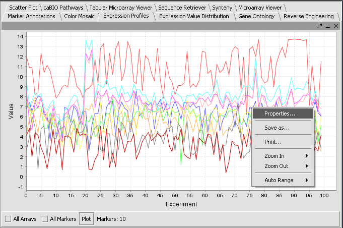
For each active marker (default is all), a line showing the expression value vs array is graphed. Each marker is displayed with a separate color line. The Plot button must be pushed to draw the display. If a subset of markers has been activated, the number active is shown adjacent to the Markers label. Right-click options are shown.
Scatter Plot
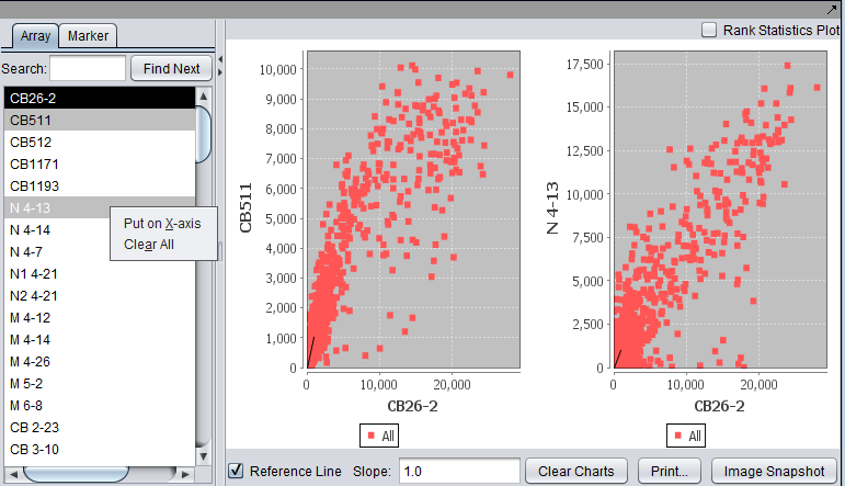
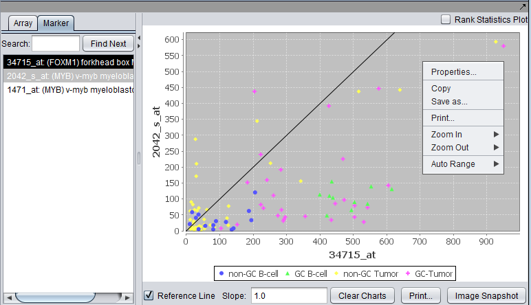
A pairwise (array vs. array and marker vs. marker) comparison and plotting of expression values. The first array or marker selected serves as the x-axis reference, shown with a dark background; this can also be set by right-clicking and selecting the x-axis as shown). Subsequent choices are plotted against this reference. Up to six graphs can be displayed. Right-click options are shown in the second picture.
For two arrays, plot markers. A single marker set "All" is activated.
For two markers, plot activated arrays. Each activated array set is shown in a different color.
Preparation
Load a microarray dataset, for example the file Bcell-100.exp that is included in the geWorkbench folder "data/public_data".
Viewing a dataset
- In the Visualization Area at the top-right section of the interface, select any viewer described above, for example the Microarray Viewer component.
- When no marker or array sets are activated, all markers or arrays, respectively, will be used.
