Difference between revisions of "Color Mosaic"
(→Export data) |
|||
| Line 1: | Line 1: | ||
| + | {{TutorialsTopNav}} | ||
| + | |||
==Overview== | ==Overview== | ||
Revision as of 18:33, 28 July 2009
Contents
Overview
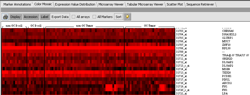
The Color Mosaic component displays expression values for all active arrays and markers using an "Eisen" plot "heat map" colored by either an absolute or relative color scheme. It is located in the View Area ( see figure below) in the top-right of the application.
Measurements in the selected microarray dataset are displayed as a two-dimensional matrix with each column representing an array and each row representing a genes/marker. The color spectrum is used to indicate the magnitudes of the measurements.
When the Color Mosaic component is used to display the results of a t-test or ANOVA, it will display the p-values to the right of each marker.
The figure below depicts the Color Mosaic component in Absolute display mode. Four sets of arrays in the Bcell-100.exp tutorial dataset have been activated and each set is labeled in the display. Both Accession and Label (gene name) buttons have been activated and the figure shows both names being displayed for each marker.
Controls
Display
Pushing the Display button causes the view to be drawn or redrawn.
Accession
If the Accession button is active, probeset names will be displayed at right for each marker.
Label
If the Label button is active, gene names will be displayed at right for each marker.
Export data
Export p-values to a file.
Sort
Bulb icon
Activates a mouse-over tool tip. When the cursor is placed over a point on the color mosaic display, the array, marker, and expression value are displayed.
Intensity slider
The slider increases or decreases the thresholds used to define the color codings, as explained below in the Color Key section.
Color key
The Color key shows the range of colors available in the currently set Visualization preference (Menu->Tools->Preferences->Visualization). There are two available color schemes: Absolute and Relative. In each, the lowest and highest expression values correspond to the most saturated colors, and values closer to the middle are indicated by shading into a third color.
Absolute
Colors are calculated on an absolute scale centered about zero (when the Intensity Slider is in the middle, neutral position). Values shade between the following:
- Black - zero.
- Red - positive values.
- Green - negative values.
Relative
Colors are calculated relative to the mean for each marker (when the Intensity Slider is in the middle, neutral position). Expression value colors are directly comparable only within a particular marker.
- White - mean value for marker.
- Red - values greater than the mean.
- Blue - values less than the mean.
Gene Height and Gene Width
Change the size (number of pixels) assigned to each marker (row height) or array (column width) in the color mosaic. The associated labels for each marker scale proportionately.
All Markers
Overrides any set of markers activated in the Markers component to display all markers. Disabled in some displays such as ANOVA.
All Arrays
Overrides any set of arrays activated in the Arrays/Phenotypes component to display results from all arrays. Disabled in some displays such as ANOVA.
Printer Icon
Send the heat-map to the printer.
Actions
Left-clicking on an entry
Left-clicking on any location (tile) in the mosaic will highlight the corresponding gene probe in the Markers component, and the corresponding array in the Arrays/Phenotypes component.
Right-clicking
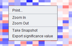
Right-clicking anywhere on the color mosaic display will bring up a menu with the following entries, as shown in the below figure:
Send the heat map to the printer
Zoom-in/ Zoom-out
Increase/decrease size of color mosaic
Take Snapshot
Save an image of the heat map to the Project Folders component.
Export significance value
Export p-values from displayed ANOVA / t-test result.


