Difference between revisions of "Volcano Plot"
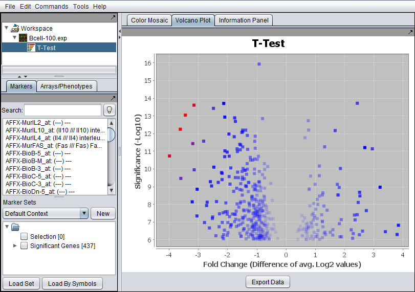
(Created page with "{{TutorialsTopNav}} Image:Volcano_plot.png The Volcano Plot visualizer graphs the log2 fold change for each marker against the -log10 of the P-value. It is only availab...") |
|||
| Line 5: | Line 5: | ||
| − | The Volcano Plot visualizer graphs the log2 fold change for each marker | + | The Volcano Plot visualizer graphs the log2 fold change for each marker against the -log10 of the P-value. |
It is only available when a t-test result is selected in the Project Folders component. | It is only available when a t-test result is selected in the Project Folders component. | ||
| + | ==Fold Change== | ||
| + | The method used to calculate fold change depends on whether the data was marked as log2 transformed or not during the t-test using the "Data is log2 transformed" box. | ||
| − | + | * "Data is log2 transformed" box was not checked: the fold change is calculated, for each marker, as the average expression in the Case set divided by the average expression in the control set. The Log2 transform of these values are displayed. | |
| + | |||
| + | * "Data is log2 transformed" box was checked: In this case, for each marker, the average the log2 case values minus the average of the log2 control values is displayed. | ||
'''Color scheme''' - the lower 2/3 of the absolute values of the (fold change) * (significance) are colored in shades from light blue (lowest values) to dark blue (highest values). The highest 1/3 of such values are colored from dark blue (lowest values) to red (highest values). | '''Color scheme''' - the lower 2/3 of the absolute values of the (fold change) * (significance) are colored in shades from light blue (lowest values) to dark blue (highest values). The highest 1/3 of such values are colored from dark blue (lowest values) to red (highest values). | ||
Revision as of 11:20, 8 September 2011
The Volcano Plot visualizer graphs the log2 fold change for each marker against the -log10 of the P-value.
It is only available when a t-test result is selected in the Project Folders component.
Fold Change
The method used to calculate fold change depends on whether the data was marked as log2 transformed or not during the t-test using the "Data is log2 transformed" box.
- "Data is log2 transformed" box was not checked: the fold change is calculated, for each marker, as the average expression in the Case set divided by the average expression in the control set. The Log2 transform of these values are displayed.
- "Data is log2 transformed" box was checked: In this case, for each marker, the average the log2 case values minus the average of the log2 control values is displayed.
Color scheme - the lower 2/3 of the absolute values of the (fold change) * (significance) are colored in shades from light blue (lowest values) to dark blue (highest values). The highest 1/3 of such values are colored from dark blue (lowest values) to red (highest values).
Export Data - The data depicted in the volcano plot is exported to a CSV format file. The column headers are: Probe Set Name, Gene Name, p-Value, Fold Change.

